
시배's Android
Compose Docs | Custom Design Systems 본문
Compose의 맞춤 디자인 시스템 | Jetpack Compose | Android Developers
Compose의 맞춤 디자인 시스템 컬렉션을 사용해 정리하기 내 환경설정을 기준으로 콘텐츠를 저장하고 분류하세요. Material은 권장되는 디자인 시스템이며 Jetpack Compose는 Material 구현을 제공하지만,
developer.android.com
머티리얼은 권장 디자인 시스템이고 젯팩 컴포즈에는 머티리얼 구현이 포함되어 있지만, 반드시 머티리얼을 사용해야 하는 것은 아닙니다. 머티리얼은 전적으로 공개 API를 기반으로 구축되었으므로 동일한 방식으로 자신만의 디자인 시스템을 만들 수 있습니다.
몇 가지 접근 방식을 사용할 수 있습니다:
- 추가 테마 값으로 MaterialTheme 확장하기
- 색상, 타이포그래피 또는 모양과 같은 하나 이상의 머티리얼 시스템을 사용자 정의 구현으로 대체하면서 다른 시스템은 유지합니다.
- MaterialTheme을 대체할 완전한 커스텀 디자인 시스템 구현하기
머티리얼 컴포넌트를 커스텀 디자인 시스템과 함께 계속 사용하고 싶을 수도 있습니다. 이렇게 하는 것도 가능하지만 접근 방식에 맞게 몇 가지 유의해야 할 사항이 있습니다.
Extending Material Theming
머티리얼 컴포즈는 머티리얼 테마를 밀접하게 모델링하여 머티리얼 가이드라인에 따라 간단하고 유형별로 안전하게 만들 수 있습니다. 그러나 추가 값을 사용하여 색상, 타이포그래피 및 모양 세트를 확장할 수 있습니다.
가장 간단한 방법은 확장 프로퍼티를 추가하는 것입니다:
// Use with MaterialTheme.colors.snackbarAction
val Colors.snackbarAction: Color
    get() = if (isLight) Red300 else Red700

// Use with MaterialTheme.typography.textFieldInput
val Typography.textFieldInput: TextStyle
    get() = TextStyle(/* ... */)

// Use with MaterialTheme.shapes.card
val Shapes.card: Shape
    get() = RoundedCornerShape(size = 20.dp)
이는 MaterialTheme 사용 API와의 일관성을 제공합니다. Compose 자체에서 정의한 예로, Colors.isLight에 따라 기본과 표면 사이의 프록시 역할을 하는 primarySurface가 있습니다.
또 다른 접근 방식은 MaterialTheme과 그 값을 "감싸는" 확장 테마를 정의하는 것입니다.
기존 머티리얼 색상을 유지하면서 두 가지 색상(3차 및 온 3차)을 추가하고 싶다고 가정해 보겠습니다:
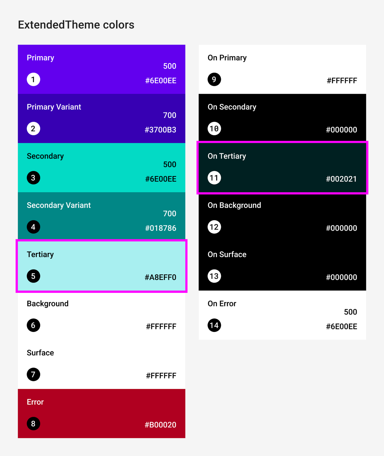
@Immutable
data class ExtendedColors(
    val tertiary: Color,
    val onTertiary: Color
)

val LocalExtendedColors = staticCompositionLocalOf {
    ExtendedColors(
        tertiary = Color.Unspecified,
        onTertiary = Color.Unspecified
    )
}

@Composable
fun ExtendedTheme(
    /* ... */
    content: @Composable () -> Unit
) {
    val extendedColors = ExtendedColors(
        tertiary = Color(0xFFA8EFF0),
        onTertiary = Color(0xFF002021)
    )
    CompositionLocalProvider(LocalExtendedColors provides extendedColors) {
        MaterialTheme(
            /* colors = ..., typography = ..., shapes = ... */
            content = content
        )
    }
}

// Use with eg. ExtendedTheme.colors.tertiary
object ExtendedTheme {
    val colors: ExtendedColors
        @Composable
        get() = LocalExtendedColors.current
}
이는 MaterialTheme 사용 API와 유사합니다. 또한 MaterialTheme과 같은 방식으로 확장 테마를 중첩할 수 있으므로 여러 테마를 지원합니다.
Using Material components
머티리얼 테마를 확장할 때 기존 머티리얼 테마 값은 유지되며 머티리얼 컴포넌트는 여전히 합리적인 기본값을 갖습니다.
컴포넌트에서 확장된 값을 사용하려면 자체 컴포저블 함수로 래핑하여 변경하려는 값을 직접 설정하고 다른 값을 포함된 컴포저블에 파라미터로 노출하면 됩니다:
@Composable
fun ExtendedButton(
    onClick: () -> Unit,
    modifier: Modifier = Modifier,
    content: @Composable RowScope.() -> Unit
) {
    Button(
        colors = ButtonDefaults.buttonColors(
            containerColor = ExtendedTheme.colors.tertiary,
            contentColor = ExtendedTheme.colors.onTertiary
            /* Other colors use values from MaterialTheme */
        ),
        onClick = onClick,
        modifier = modifier,
        content = content
    )
}@Composable
fun ExtendedApp() {
ExtendedTheme {
/*...*/
ExtendedButton(onClick = { /* ... */ }) {
/* ... */
}
}
}Replacing Material systems
머티리얼 테마를 확장하는 대신 색상, 타이포그래피 또는 모양과 같은 하나 이상의 시스템을 사용자 지정 구현으로 대체하면서 다른 시스템은 그대로 유지할 수 있습니다.
색상 시스템은 유지하면서 유형 및 모양 시스템을 교체하고 싶다고 가정해 보겠습니다:

@Immutable
data class ReplacementTypography(
    val body: TextStyle,
    val title: TextStyle
)

@Immutable
data class ReplacementShapes(
    val component: Shape,
    val surface: Shape
)

val LocalReplacementTypography = staticCompositionLocalOf {
    ReplacementTypography(
        body = TextStyle.Default,
        title = TextStyle.Default
    )
}
val LocalReplacementShapes = staticCompositionLocalOf {
    ReplacementShapes(
        component = RoundedCornerShape(ZeroCornerSize),
        surface = RoundedCornerShape(ZeroCornerSize)
    )
}

@Composable
fun ReplacementTheme(
    /* ... */
    content: @Composable () -> Unit
) {
    val replacementTypography = ReplacementTypography(
        body = TextStyle(fontSize = 16.sp),
        title = TextStyle(fontSize = 32.sp)
    )
    val replacementShapes = ReplacementShapes(
        component = RoundedCornerShape(percent = 50),
        surface = RoundedCornerShape(size = 40.dp)
    )
    CompositionLocalProvider(
        LocalReplacementTypography provides replacementTypography,
        LocalReplacementShapes provides replacementShapes
    ) {
        MaterialTheme(
            /* colors = ... */
            content = content
        )
    }
}

// Use with eg. ReplacementTheme.typography.body
object ReplacementTheme {
    val typography: ReplacementTypography
        @Composable
        get() = LocalReplacementTypography.current
    val shapes: ReplacementShapes
        @Composable
        get() = LocalReplacementShapes.current
}
Using Material components
하나 이상의 머티리얼 테마 시스템이 교체된 경우 머티리얼 컴포넌트를 그대로 사용하면 원치 않는 머티리얼 색상, 유형 또는 모양 값이 발생할 수 있습니다.
컴포넌트에서 대체 값을 사용하려면 자체 컴포저블 함수로 래핑하여 관련 시스템의 값을 직접 설정하고 다른 값을 포함된 컴포저블에 파라미터로 노출하세요.
@Composable
fun ReplacementButton(
    onClick: () -> Unit,
    modifier: Modifier = Modifier,
    content: @Composable RowScope.() -> Unit
) {
    Button(
        shape = ReplacementTheme.shapes.component,
        onClick = onClick,
        modifier = modifier,
        content = {
            ProvideTextStyle(
                value = ReplacementTheme.typography.body
            ) {
                content()
            }
        }
    )
}@Composable
fun ReplacementApp() {
ReplacementTheme {
/*...*/
ReplacementButton(onClick = { /* ... */ }) {
/* ... */
}
}
}Implementing a fully-custom design system
머티리얼 테마를 완전한 사용자 정의 디자인 시스템으로 대체할 수 있습니다. 머티리얼 테마가 제공하는 시스템은 다음과 같습니다:
- 색상, 타이포그래피 및 모양: 머티리얼 테마 시스템
- 콘텐츠알파: 텍스트 및 아이콘에서 강조를 전달하기 위한 불투명도 수준
- TextSelectionColors: 텍스트 및 텍스트 필드에서 텍스트 선택에 사용되는 색상
- 리플 및 리플 테마: 표시의 머티리얼 구현
머티리얼 컴포넌트를 계속 사용하려면 원치 않는 동작을 피하기 위해 사용자 정의 테마에서 이러한 시스템 중 일부를 교체하거나 컴포넌트에서 시스템을 처리해야 합니다.
그러나 디자인 시스템은 머티리얼이 의존하는 개념에만 국한되지 않습니다. 기존 시스템을 수정하고 새로운 클래스 및 유형을 사용하여 완전히 새로운 시스템을 도입하여 다른 개념이 테마와 호환되도록 만들 수 있습니다.
다음 코드에서는 그라디언트를 포함하는 사용자 지정 색상 시스템(List<Color>)을 모델링하고, 유형 시스템을 포함하고, 새로운 입면 시스템을 도입하고, MaterialTheme에서 제공하는 다른 시스템을 제외합니다:

@Immutable
data class CustomColors(
    val content: Color,
    val component: Color,
    val background: List<Color>
)

@Immutable
data class CustomTypography(
    val body: TextStyle,
    val title: TextStyle
)

@Immutable
data class CustomElevation(
    val default: Dp,
    val pressed: Dp
)

val LocalCustomColors = staticCompositionLocalOf {
    CustomColors(
        content = Color.Unspecified,
        component = Color.Unspecified,
        background = emptyList()
    )
}
val LocalCustomTypography = staticCompositionLocalOf {
    CustomTypography(
        body = TextStyle.Default,
        title = TextStyle.Default
    )
}
val LocalCustomElevation = staticCompositionLocalOf {
    CustomElevation(
        default = Dp.Unspecified,
        pressed = Dp.Unspecified
    )
}

@Composable
fun CustomTheme(
    /* ... */
    content: @Composable () -> Unit
) {
    val customColors = CustomColors(
        content = Color(0xFFDD0D3C),
        component = Color(0xFFC20029),
        background = listOf(Color.White, Color(0xFFF8BBD0))
    )
    val customTypography = CustomTypography(
        body = TextStyle(fontSize = 16.sp),
        title = TextStyle(fontSize = 32.sp)
    )
    val customElevation = CustomElevation(
        default = 4.dp,
        pressed = 8.dp
    )
    CompositionLocalProvider(
        LocalCustomColors provides customColors,
        LocalCustomTypography provides customTypography,
        LocalCustomElevation provides customElevation,
        content = content
    )
}

// Use with eg. CustomTheme.elevation.small
object CustomTheme {
    val colors: CustomColors
        @Composable
        get() = LocalCustomColors.current
    val typography: CustomTypography
        @Composable
        get() = LocalCustomTypography.current
    val elevation: CustomElevation
        @Composable
        get() = LocalCustomElevation.current
}
Using Material components
컴포넌트에서 커스텀 값을 사용하려면 컴포저블 함수로 래핑하여 관련 시스템에 대한 값을 직접 설정하고 다른 값을 포함된 컴포저블에 파라미터로 노출하세요.
사용자 정의 테마에서 설정한 값에 액세스하는 것이 좋습니다. 또는 테마에서 색상, 텍스트 스타일, 모양 또는 기타 시스템을 제공하지 않는 경우 하드코딩할 수 있습니다.
@Composable
fun CustomButton(
    onClick: () -> Unit,
    modifier: Modifier = Modifier,
    content: @Composable RowScope.() -> Unit
) {
    Button(
        colors = ButtonDefaults.buttonColors(
            containerColor = CustomTheme.colors.component,
            contentColor = CustomTheme.colors.content,
            disabledContainerColor = CustomTheme.colors.content
                .copy(alpha = 0.12f)
                .compositeOver(CustomTheme.colors.component),
            disabledContentColor = CustomTheme.colors.content
                .copy(alpha = ContentAlpha.disabled)
        ),
        shape = ButtonShape,
        elevation = ButtonDefaults.elevatedButtonElevation(
            defaultElevation = CustomTheme.elevation.default,
            pressedElevation = CustomTheme.elevation.pressed
            /* disabledElevation = 0.dp */
        ),
        onClick = onClick,
        modifier = modifier,
        content = {
            ProvideTextStyle(
                value = CustomTheme.typography.body
            ) {
                content()
            }
        }
    )
}

val ButtonShape = RoundedCornerShape(percent = 50)'Android > Compose Docs' 카테고리의 다른 글
| Compose Docs | Lists and grids (0) | 2023.09.17 |
|---|---|
| Compose Docs | Anatomy of a theme in Compose (0) | 2023.09.16 |
| Compose Docs | ConstraintLayout (0) | 2023.09.06 |
| Compose Docs | Instrinsic measurements (0) | 2023.09.05 |
| Compose Docs | Alignment lines (0) | 2023.09.03 |


